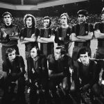
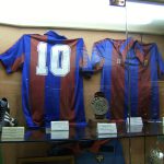
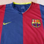
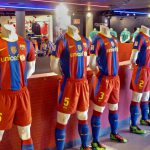
Welcome to the FC Barcelona kit history page. This is the hub for Barca official game apparel, its colours and its visual history. Check the bottom of the page for all Blaugrana related articles or view the club’s current kit.
The Colours
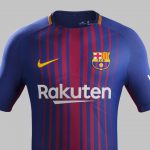
The colours of FC Barcelona are blue and garnet (deep red). They have been chosen at the club’s conception and have remained true throughout the years. It is from these colours that the club receives its famous nickname – Blaugrana (“blau” means blue in Catalan and “grana” means garnet). The team plays its home games draped in the club colours. Their jerseys are traditionally striped blue and red and their shorts are blue. The current version of the FC Barcelona kit features thin red lines on a blue background, blue shorts and blue socks. The team plays its away games in all yellow uniforms with black lettering. Its third kit is light pink with darker pink accents.
* CHECK OUT ALL FC BARCELONA KIT AND GEAR HERE! *
 The Crest
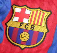
FC Barcelona crest is a bowl-shaped shield which is divided into three parts. The top left features the Saint George Cross (Creu de Sant Jordi in Catalan), which refers to the patron saint of Catalonia. The top right has four red stripes on a yellow background. This is La Senyera – the Catalan flag – which according to legend shows the Four Fingers of Blood (Quatre Dits de Sang) made by King Wilfred the Hairy on a shield before going into battle against the Moors in the 9th century. The bottom of the crest has the colours of the club and an old, stylized football. In the middle, between the top and the bottom are the letters FCB, which stand for “Futbol Club Barcelona”.
Home Ground: Camp Nou
Nickname: Blaugrana
Motto: Més que un club (More than a club)
FC Barcelona Kit History
The Home Kit
There are several theories about how the colours of FC Barcelona came into existence. The club was founded in 1899 by a Swiss businessman and football player Hans Gamper (aka: Joan Gamper) and some believe that it was his wish to have his new club look exactly like his former team FC Basel that played a role. An equally plausible and more accepted theory (especially by FC Barcelona itself) is the fact that earlier that same year the Barcelona Lawn Tennis Club was formed and its colours were adopted instead. Additionally, during the second meeting of FC Barcelona board members the player director Arthur Witty allegedly proposed the club colours based on the shirts of the Merchant Taylor’s School rugby team in Liverpool which he represented a few years before. Whatever the truth, the fact is that when FC Barcelona players first took the field, they did so in blue and red. That tincture, now steeped in tradition and club culture stayed with the Catalan giants to this day, making them one of the select top football clubs in the world that have always been true to their colours.
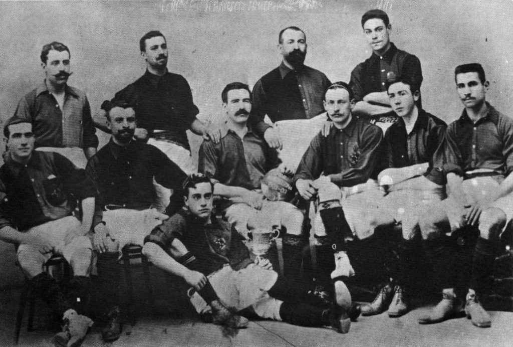
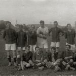
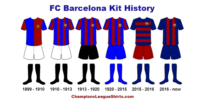
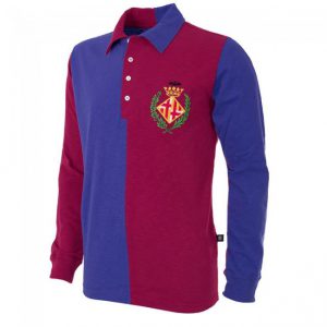
But while the colours of the club have been established from the start, the stripes that the Catalan team is now famous for did not make an appearance just yet. The first jersey of FC Barcelona was “halved”, meaning that the left side of the chest was red while the right side was blue. The sleeves alternated as well, with the left sleeve in blue and the right sleeve in red. The shorts of this first kit were white and the socks all black. That is how FC Barcelona appeared to the world for the first time and that is how it remained for the first 11 years.
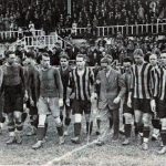
The first change came in 1910 when the club adopted the stripes it is now famous for. Having already reached the final of Copa del Rey in 1902, the team was becoming known around Spain and now it received a visual facelift. The red and blue stripes appeared just as Blaugrana started playing against French and Basque teams in the local but prestigious Pyrenees Cup, winning it four years in a row from 1910 to 1913. This came when the club started becoming a symbol of Catalan identity and the subsequent independence struggles, changing its official language from Castilian to Catalan. From 1910, the rapidly improving FC Barcelona has been identified by striped, red and blue home jerseys – a visual image that has remained to this day. The “shirt that never sleeps” was set.
Click to enlarge
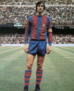
In the next few decades, only very minor cosmetic adjustments were made to the Barcelona tops. The rest of the uniform however, underwent some changes. In 1913 the shorts matched the socks and were now equally black. They lasted like this till 1920, when both the shorts and the socks turned blue. These formed the uniforms of Barcelona that we know today and over the years the club placed them like a stamp over various domestic and international trophies. Some of the most remembered were winning the inaugural season of Primera División (La Liga) in 1929, various Campionat de Catalunya triumphs and finally the European Cup Winners’ Cup in 1979.
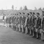
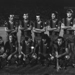
Initially, the stripes of FC Barcelona remained roughly the same width throughout the years, waxing and waning only slightly. Starting in 1960s however, their thickness started changing and the club home uniforms entered an era of more visual variety. The colours and the concept remained the same, but each year now saw a different Barcelona shirt that stood out visibly from the previous one. This culminated in the 1999-2000 season, when to celebrate 100 years of existence, the “halved” designed was brought back, although now with dark blue sleeves on both sides. The stripes returned the following year, but in 2008 once again the “halved” uniforms were used for one season.
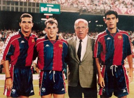
When talking about stripes, it’s necessary to mention their orientation and for Barcelona it has always been vertical. This was the club’s visual identity since its early years and part of the club culture. It came therefore as a shock to everyone when the sacrosanct vertical lines were replaced by horizontal hoops by the kit manufacturer Nike for the 2015-2016 season. Seen as a purely commercial move to sell more football tops, this version of the shirt was met with huge controversy and widely panned by the Barca fans. It didn’t survive. The next year, Barcelona was back to the traditional vertical stripes, making the 2015-2016 season the only time the club broke with its visual tradition. To see the club’s current kit, click here.
Click to enlarge

The Sponsorship
Worth mentioning are the corporate sponsorship adventures of the club, as they are quite unique themselves. FC Barcelona defied shirt sponsorship far longer than its European competition. Even in 2005, when other clubs have been displaying corporate lettering on their chests for many years already, Barca only had a small logo of the local non-profit Catalan TV channel TV3 on its left sleeve (the right one is always reserved for whatever competition Barca is currently playing in). In 2006 first letters finally appeared on the Blaugrana’s fronts. They were however, the word “UNICEF” and it was actually Barca itself that paid the charity a yearly sum of money in what can be only called reverse-sponsorship. In 2011 however, the corporate money started finally rolling in. The letters “UNICEF” were relegated to the back of the jersey (Barcelona still pays UNICEF every year) to be replaced by Qatar Foundation and in 2013 Qatar Airways. In 2014 the Turkish appliance maker Beko replaced TV3 on the left sleeve and finally in 2017 the club signed a massive contract with the Japanese e-commerce giant Rakuten, which now appears on the front of their shirts.
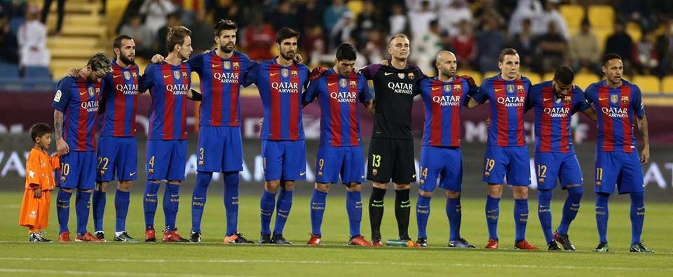
Barcelona had only three kit suppliers over the years. Till 1982, there was no official supplier. That year, the Barcelona sports brand Meyba has been chosen. The Meyba kits lasted till 1992 till the Italian sportswear manufacturer Kappa took over. In 1998 however, the supplier changed once again – this time to Nike.
The Away Kit
While the FC Barcelona home kit remained true to its concept throughout the years, their away kit has been a veritable fashion show. The club began playing their away games mainly in yellow which at times was embellished with red and blue stripes. The shirts of those times were almost always long sleeved and often had collars. Frequently they were either laced up at the neck or more commonly fitted with a few buttons.
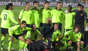
In the 30s the club wore all blue shirts – a choice that lasted for most of the decade. In the 40s however, red shirts were adopted, still usually collared and buttoned at the neck. The most interesting change though happened in the 50s. Even thought they were often augmented with blue and red stripes, the away jerseys of Barca became white and stayed that way for a number of years. As the club matured, the rivalry with the capital based Real Madrid intensified and white was the colour of the Madrid team. Consequently, the white was eventually abandoned for Barca and while it returned for a few select seasons years later, it was always heavily accented with red and blue. A version of light blue jersey was introduced to the Blaugrana’s away uniforms next – a colour that would prove to be popular and would also make regular appearances every now and then throughout the later seasons.
The 70s saw Barcelona return to yellow for their away games. This design, which lasted into the late 80s had a prominent blue and red stripe running from the right shoulder to the left hip, across the chest of the jersey. This stripe later straightened and ran from the right shoulder vertically down. Yellow was a popular choice with the fans and it stayed with the team for almost two decades. It heralded the arrival of the Cruyff years and led the club right up to the era of the Dream Team.
Click to enlarge
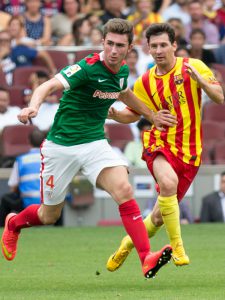
Beginning in the late 80s, all uniformity left Barcelona away kits. From then on, they changed colours almost religiously, alternating between blue, red and even orange. Initially, they were relatively monochrome but in the 90s – when visual design flair took over football fashion – the patterns on the jerseys started getting more and more elaborate. The most striking design came in the 2013-14 season, when the club adopted red and yellow stripes for their away colours. This choice was a tribute to the Senyera flag of Catalonia and was considered a political move by many. The jersey was accompanied by red shorts and with Barcelona quarter-finals loss to Atletico in the Champions League and subsequent loss of La Liga title aspirations to the same team was considered not very lucky. It did however, leave a lasting visual impression and is often arguably considered one of Barcelona’s best.
Over the years, the away colours of FC Barcelona have varied quite extensively. The most common hues have been blue, red, yellow, orange and even green. In contrast to home uniforms which frequently use yellow as trim, the embellishments on the away shirts are most often red and blue, subtly showcasing the colours of Blaugrana even during away fixtures.
FC Barcelona Crest History
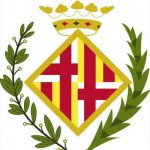
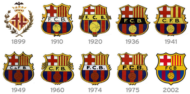
The crest of FC Barcelona began as the city coat of arms, enclosed in a circle made of a laurel and a palm branch and topped with a bat. The coat of arms itself was composed of a crown, the Saint George Cross and the Senyera flag – all symbols of the region. This crest appeared almost immediately on the first shirts of the team and was worn till 1910.
In 1910, shortly after the club was saved from its first serious crisis, a decision was made to give the club its own special crest. A competition was held among the members and a design made by Carles Comamala was chosen. Comamala was a Barca player at the time (1903-1912) and a medical student with talent for art. Once selected, his design became the new crest of FC Barcelona and has remained so to this day, altered only slightly over the years via cosmetic adaptations.
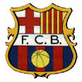
Throughout time, the changes to the club crest have been restricted mainly to the lettering in the middle and the colour of the ball. The overall shape of its outline has been altered a little – usually to reflect the current design fashions – but stayed true to the bowl-shaped shield. The ball – initially yellow – became red in 1949 but returned to its original colour in 2002. The letters (originally FCB) were changed to CFB in 1941, after the coming to power of Franco, when the club was forced to use the Spanish version of the name. The same adaptation saw two red bars removed from the top right of the flag, to minimize the resemblance to the Catalan flag. The bars however returned in 1949 for the 50th anniversary of the club and the letters were recovered in late 1974. The background color underneath the letters also underwent a few changes, from white to yellow to black and then eventually to yellow again.
The current version of the crest is based on an adaptation made by designer Claret Serrahima in 2002. It takes away the dots between the letters, reduces some pointed edges and makes all the lines more modern for easier reproduction in all formats.
FC Barcelona Kit History – ChampionsLeagueShirts.com
Image sources: 1, 2, 3, 4, 5, 6, 7, 8, 9, 10, 11, 12, 13, 14, 15, 16, 17, 18, 19, 20, 21, 22, 23, 24, 25, 26
RELATED POSTS
 The Kit of FC Barcelona for 2018- One of the most iconic images in football, the kit of FC Barcelona for 2018 is the visual identity of the Catalan club. A constant presence in the Champions League, Barca is one of the most powerful teams in football and often one of the most spectacular. From the wall of ter Stegen in net through the cool and collected… [...]

