
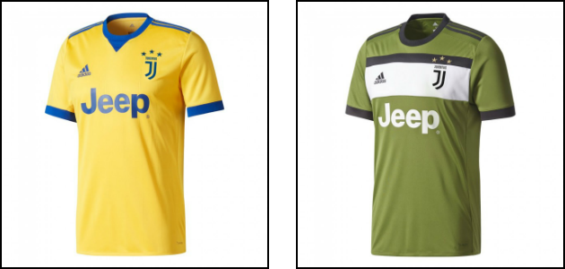
The famous Juventus black and white shirts have been a staple of the Champions League for many years. Known as one of the most successful clubs in the world, the Bianconeri take the field in zebra striped jerseys. In summer of 2017 however, when the Turin squad entered the pitch for the first time that season, something was different. Embroidered on the chest was a new, redesigned crest of the club and it looked nothing like its previous incarnations. Juventus entered a new era.

The shirt itself followed the standard Juventus black and white striped pattern, which – as customary – was slightly altered from its previous season. The collar turned white and the number of stripes increased, returning to a more classic design. The sponsor lettering turned white and the underarm Adidas stripes (which conveniently also happen to also be black and white) became a bit more visible under the arms. All in all, a good upgrade for a more elegant look. After all, fashion is almost as important in Italy as football!
The major change however, was the aforementioned logo. It was hard to miss. Drawn in black and plastered on a white part of the shirt, it was no longer oval but featured instead a stylized letter “J” with the name of the club above it. The shape of the logo was elongated vertically – like the oval was – but was drawn to resemble a shield instead. It was very different crest that did away with the club’s previous designs. Tradition seemed broken. A new Juventus took the field.

THE REASON
The club was very quick to justify the change, most likely expecting a period of public dismay. Manfredi Ricca of Interbrand – the company behind the redesign – explained the vision to the world. According to him, the idea of the new logo is to help market the club as a BRAND to the world. The goal is to market the club not only to a more widespread global audience but also to people who are not football fans. This more multimedia friendly and more eye-catching new crest is designed to do just that.
Ricca stated: “The keystone of this brand is to make sure that Juventus is always going to be anchored to football, but that it is also going to be beyond football. We want their brand to stand for football at the core, but beyond that a philosophy that can appeal to people who are not necessarily football fans. The idea is to widen the audience and make sure the brand is loved not just by football fans.”
THE MEANING
So, what does this mean? Basically, Juventus is looking to redesign itself in the eyes of the world as not just a football team but a marketable name that can be used to promote and sell products. As shocking as it may be to believe, there is a large group of people that don’t follow football or simply don’t pay too much attention to Juventus. Reaching this audience to gain their support or simply to gain the money from their wallets is not easy and competition is fierce. But Juventus is willing to put in the effort. The new crest is supposed to have a much more eye-catching form that with time will attract more people to the cause. While the club is hoping to gain new supporters, in this context it mostly means more revenue from those who normally would not put money towards Juventus’ coffers. In short, Juventus wants to be a globally recognizable symbol that can be used to sell stuff.
THE CONTROVERSY
Any redesign of a club crest is bound to have a reaction among its fans. In this case, it was strong and fierce. The majority of Juventus supporters have not taken well to the club’s direction to seek more popularity among non-football fans for fear of what it may mean. The biggest worry was that the club would diversify and that it would spend a considerable effort to market a variety products to the world, taking away from its focus of playing football. The club was quick to quell those fears, but a certain sense of worry – and even betrayal – never left the die-heard fans. The crest of a team is nothing short of sacred and while slight redesigns are expected, this complete change with a new focus seems to endanger the club’s tradition. Needless to say, the hew crest has many opponents and time will only tell whether this move will create more fans, or simply alienate the club’s supporters.
![]()
There is no doubt that the face of today’s sports is changing in the constantly evolving corporate society. Brand loyalty – if properly maintained – can make or break companies and corporations and football is starting to follow this trend. In the realm of worldwide brand loyalty the Italian clubs are falling behind and Juventus is making the first move to change those fortunes. Already clubs like Manchester United or Real Madrid have turned themselves into marketable brands that reach audiences in places far and wide. Athletes like Roger Federer or Michael Jordan have build successful brands that reach far beyond their sports. Christiano Ronaldo has reached audiences beyond his initial scope with his CR7 clothes line. Juventus has much to aspire to and it’s in a position where it can attempt the same. It’s likely that other clubs will soon attempt similar transformations. Time will tell if Juventus is blazing the trail or simply alienating its loyal fans in a quest for profit.
Love it or hate it, the new Juventus black and white logo is here to stay. As we celebrate great players like Gianluigi Buffon, Giorgio Chiellini, Gonzalo Higuain, David Trezeguet, or Michel Platini, we can remember the past glories of the Bianconeri. Today, it’s still the same club but with more global aspirations. Do we feel betrayed by what football is becoming? If so, then the era of the beautiful game may be coming to a slow end. If not, then we’ll proudly wear the new Juventus logo and look towards the future to new triumphs of the great – more global – Juventus.
Check here for all the curent Juventus gear.
WHAT DO YOU THINK?
How do you view this iconic change in Juventus crest? Break with tradition or a necessary evolution? Betrayal or vision? Let us know below.
ChampionsLeagueShirts.com
Love the new crest! It’s always jarring when a familiar product, service or even a website rebrands, but eventually people get used to it. It may take ultra passionate football fans a little longer but I believe they’ll end up loving that clean modern logo.
Indeed. The crest is here to stay, it seems – love it or not. And there are definitely those who love the new design, so glad to see you approve!
Hi Greg,
Great post! Wow yes that is very controversial for sure! I know here in Australia if an Aussie Rules team changes there guernsey for an away strip it is huge news. If anyone was to change the logo there would be uproar too.
Juventus being such a world wide brand I can understand that certainly their die hard fans would not like it one bit. Have they played any games in the strip as yet?
Thanks for the great post and I actually don’t mind the logo. Getting into the nike space a little 🙂
Kev
Yes, they have been playing the current season with the logo already. Still alive in Champions League, so maybe it’ll bring them luck 🙂 We’ll see!